
Overview
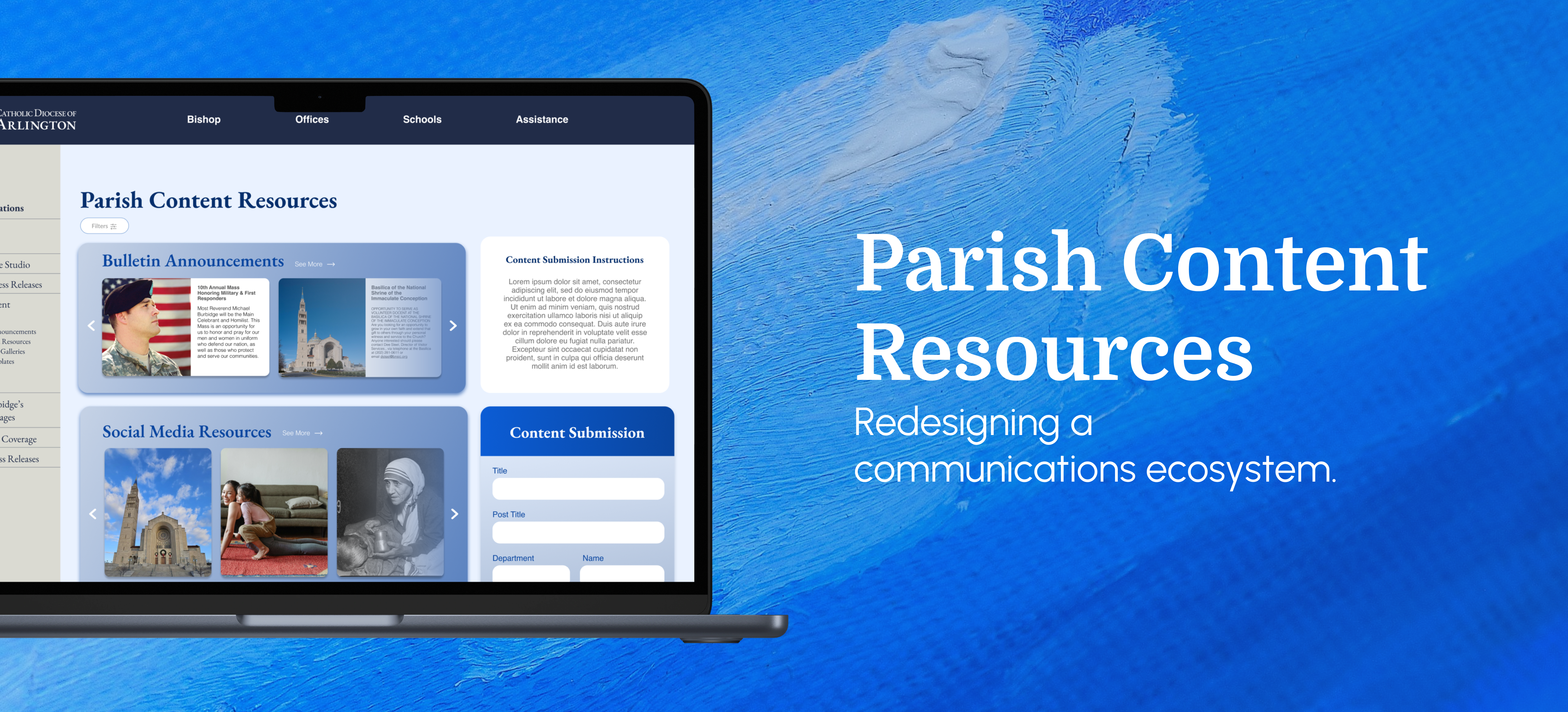
As a parish communications professional, I relied on the diocesan bulletin portal every week to find resources for parish communications. But finding the right content often meant digging through walls of text, downloading files just to preview them, and deciphering what each resource actually was.
After joining the diocesan communications team, I saw an opportunity to redesign the experience from the perspective of the people actually using it.
Context: I was the User
For roughly a year, I worked as the communications professional for a local Catholic parish, managing the website, bulletin, and social media. Each week, I used the diocesan resource portal to find content to include in parish communications.
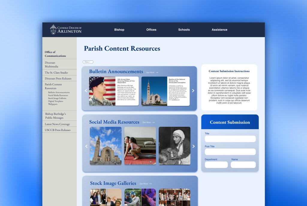
While the portal contained everything I needed, finding useful content was difficult, unintuitive, and a frustrating process.
Pain Points
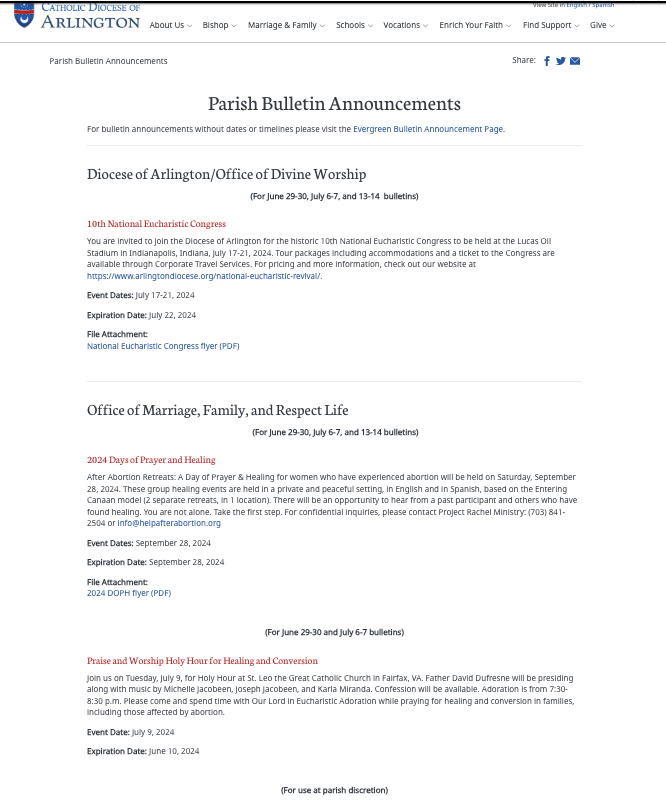
- Finding content: Resources were presented primarily as long blocks of text, making it difficult to quickly understand what was available.
- Knowing what I was getting: Graphics couldn’t be previewed without downloading them first.
- Deciding where to start: There was little visual hierarchy to help users understand what resources were available or which were relevant to their workflow.
The Problem
The diocese already produced valuable resources for parishes. The challenge was making those resources easy to discover, understand, preview, and use. The question became one of how might we help parish communications staff quickly find and use diocesan resources without having to navigate a confusing, text-heavy experience?
Contraints
- Users: The current portal supports more than just parish communications staff. It also includes…
- Chancery staff looking to submit items for parishes to use in their bulletins.
- Parish administrative staff seeking information for office visitors.
- High level diocesan leaders gleaning an overview of things happening around the diocese.
- Environment: The existing diocesan portal either needs to be refreshed within the current ecosystem or completely redesigned.
- Project Priorities: The Office of Communications is tasked with representing the Bishop of Arlington to the public and has constant tasks and projects being sent to it, thus the bulletin portal redesign had to move as quickly as possible.
Research: Personas from Lived Experience
My experience working at the parish gave me firsthand insight into the frustrations of the existing resource portal, but I knew my experience was only one perspective.
To move beyond my own assumptions, I translated the patterns I had observed into a set of user personas representing the different people who might rely on the platform. Their goals, technical comfort, time constraints, and accessibility needs helped shape the experience from the ground up, keeping the focus on what parish staff actually needed to get their work done.

Persona 1
Maria
The Parish Admin
Goals
- Keep the parish office running smoothly.
- Help parishioners, visitors, and callers find answers and connect them with the right person or resource.
- Stay on top of parish and priest happenings.
Frustrations
- Doesn’t have time to dig through large amounts of information to find one resource.
- Isn’t always sure which resources are relevant to the parish.
- Needs tools to be intuitive without requiring specialized technical knowledge.
Persona 2
Fr. Michael
The Parish Pastor
Goals
- Spiritually guide his parish.
- Stay up to date with diocesan communications.
- Work with parish staff to enrich parish life through events, guilds, ministries, and resources.
Frustrations
- Doesn’t have time to navigate complicated digital tools.
- Needs confidence that parish communications align with diocesan messaging.
- Relies on staff to translate diocesan resources into parish communications.

Persona 3
Peter
The Diocesan Director
Goals
- Expand the reach of his office’s initiatives by getting events, campaigns, and resources in front of as many parishes as possible.
- Stay informed about parish communications and understand how diocesan initiatives are being shared locally.
- Generate revenue for his office through successful programs, events, and campaigns.
Frustrations
- Creating resources that don’t get picked up by parishes.
- Difficulty knowing whether parishes are seeing or using his office’s content.
- Limited visibility into how diocesan messaging is being communicated locally.
Persona 4
Lisa
The Parish Communications Coordinator
Goals
- Find enough relevant content to fill the weekly bulletin while keeping it useful and engaging for parishioners.
- Represent the initiatives and interests that matter to the parish community and fellow staff members.
- Maintain the parish’s digital presence across its website, social media, and other communications channels.
Frustrations
- Spending too much time searching for content that is actually useful to the parish.
- Having to read through large blocks of text to understand what a resource contains.
- Balancing diocesan content with the needs and interests of her own parish
Designing with Personas in Mind
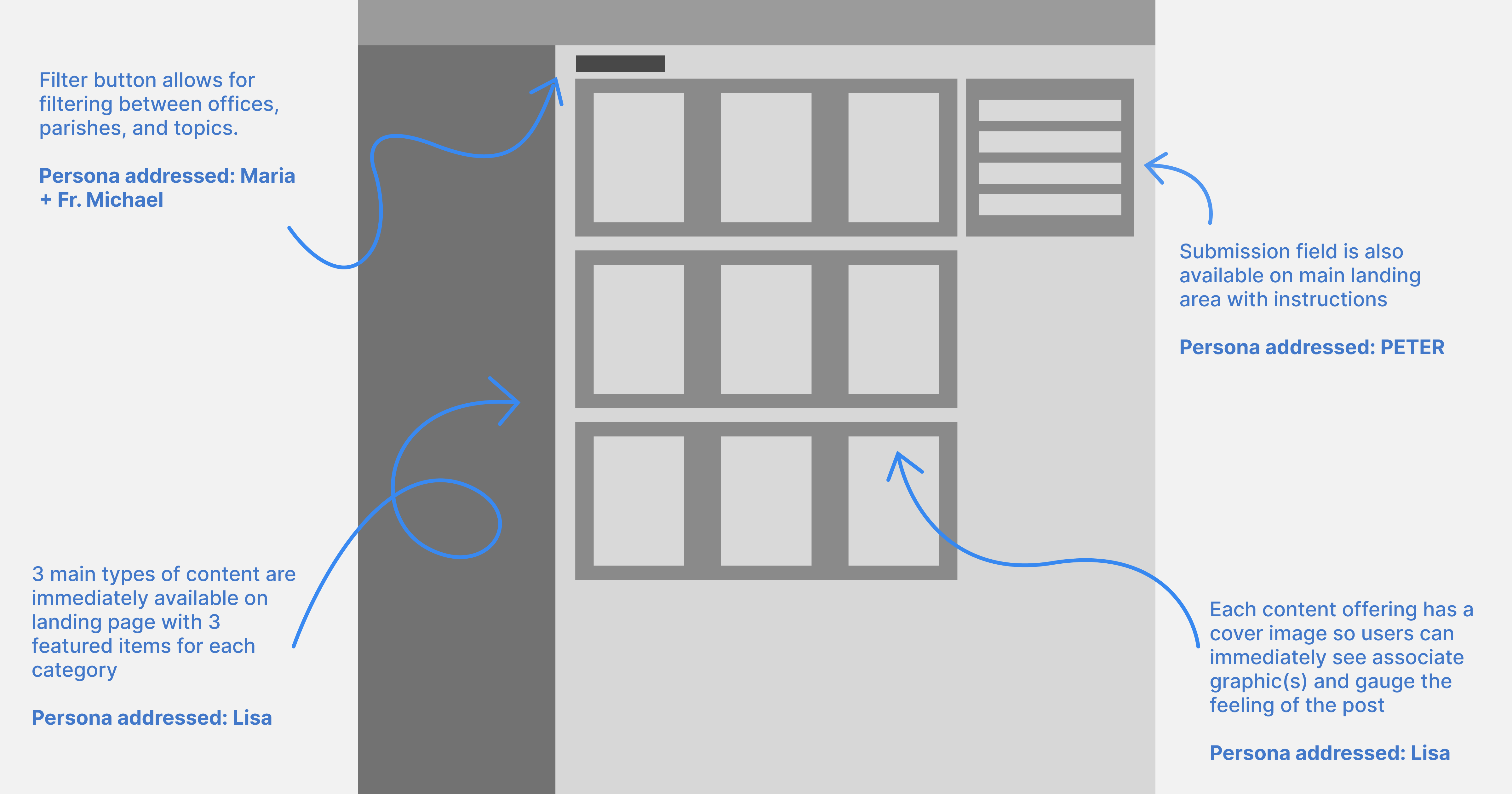
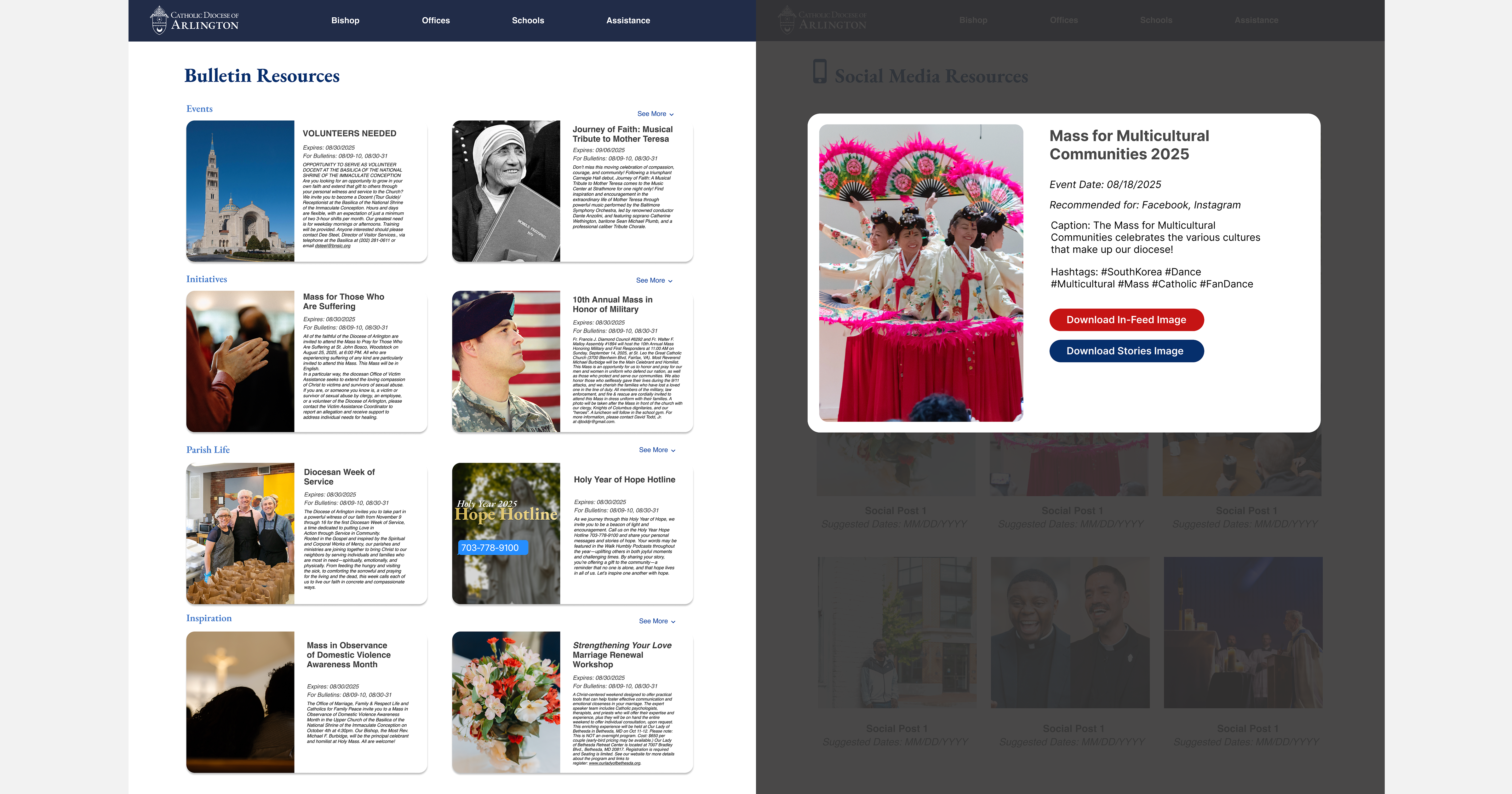
After creating and studying my user personas, I created lo-fi wireframes in Figma for a new bulletin/content portal that addressed their needs and frustrations. I had to account for the fact that the new portal would still be hosted on the existing diocesan WordPress site and design within the parameters of its custom theme.
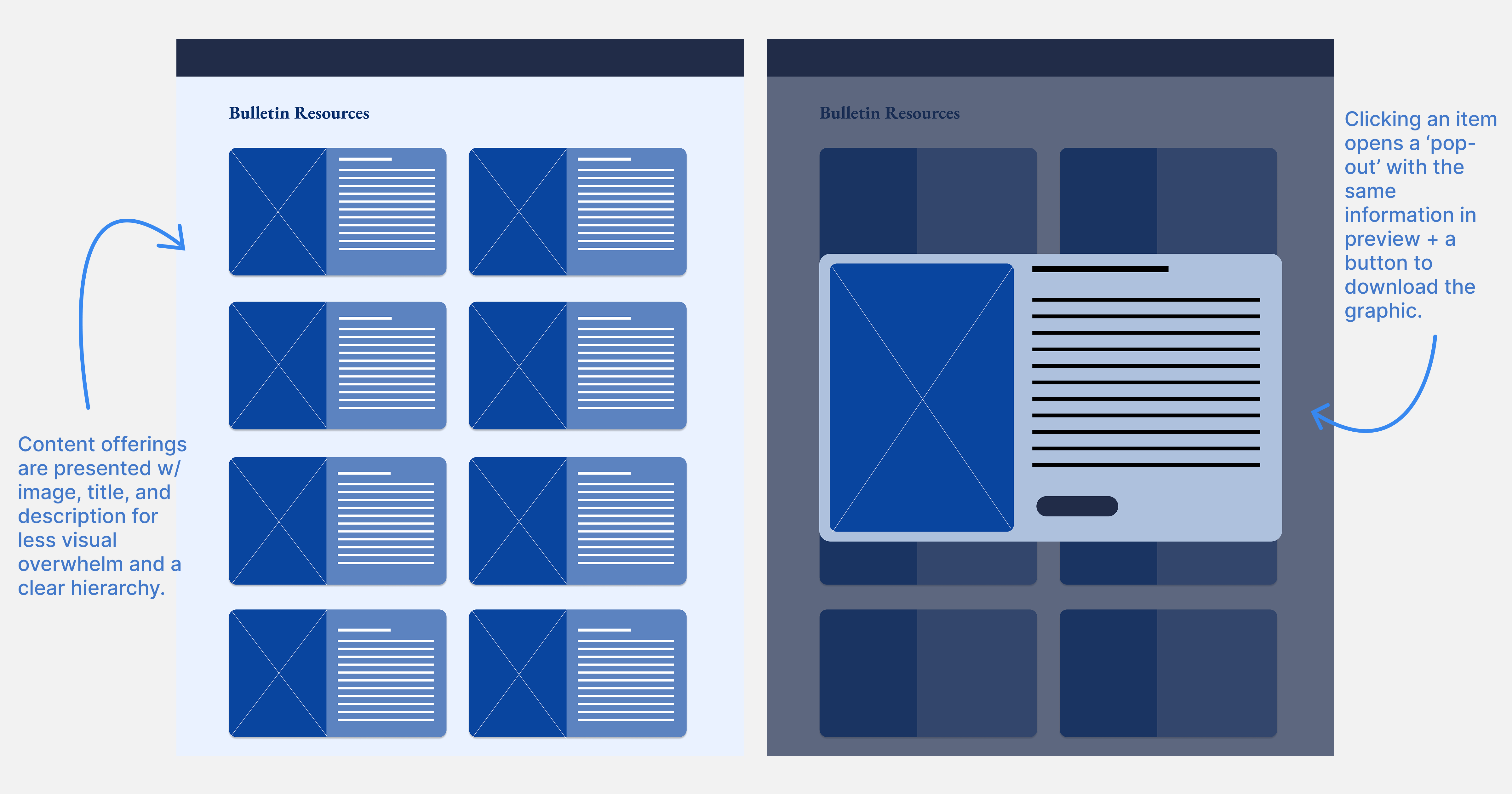
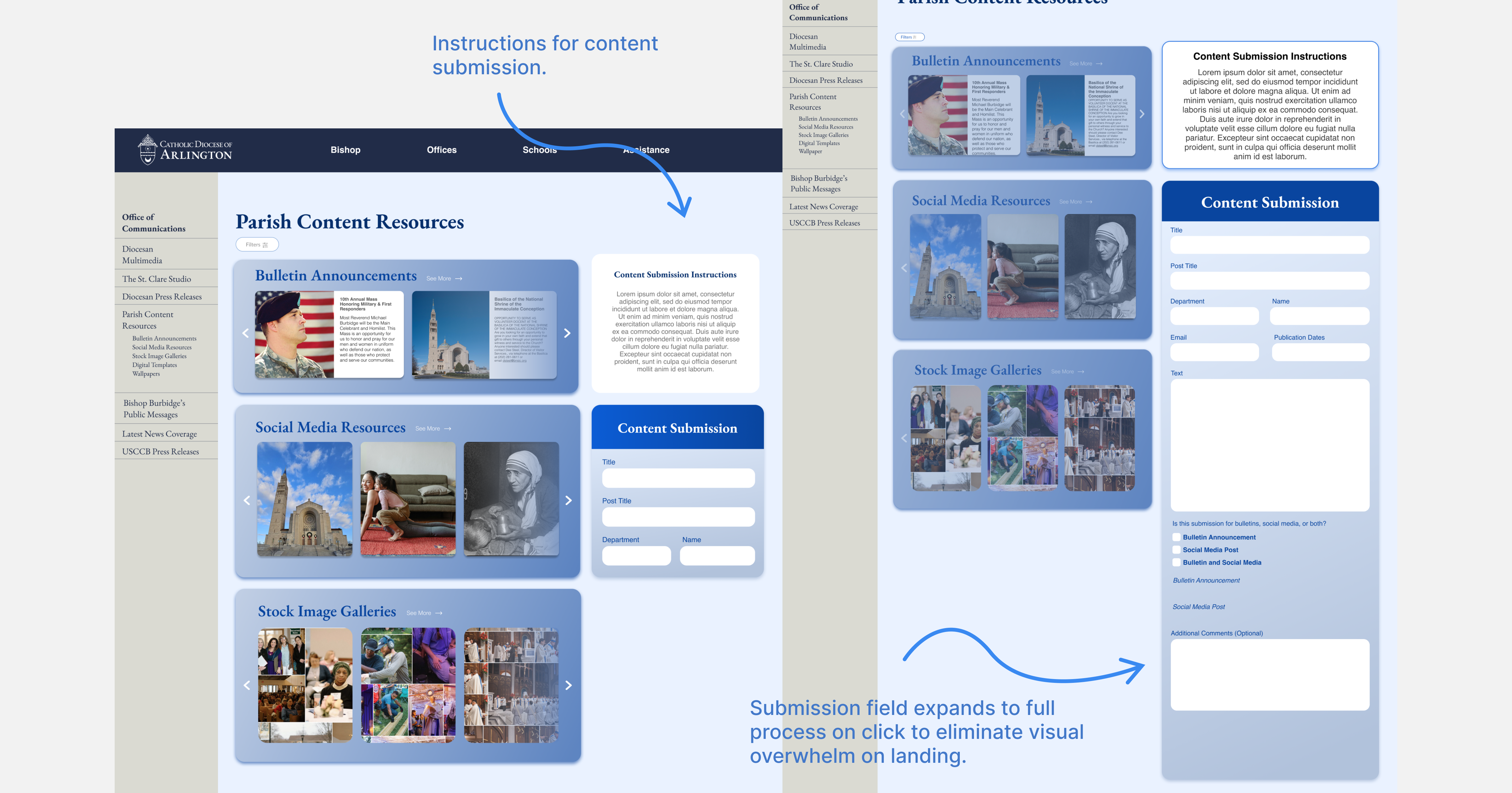
After the wirefames were approved, I designed hi-fi mockups to handoff to the diocese’s team of developers. I made sure to keep styling in line with the existing diocesan website styling.
Results & Takeaways
01: Improving the Overall User Experience
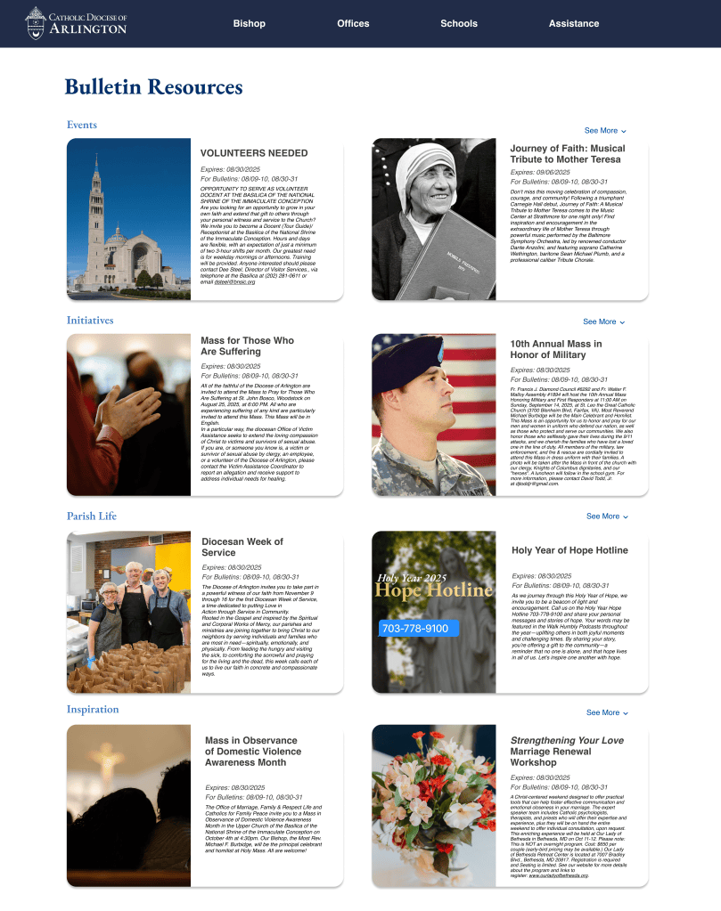
The primary result is that the redesigned portal gives parish staff a clear starting point instead of asking them to sift through a dense collection of resources. Content is organized around the three areas they use most (Bulletin, Social Media, and Stock Images) so users can quickly identify what they need and navigate directly to the appropriate resource library. This has also been validated by frequent comments made in passing from visiting parish and chancery staff about how the new portal is visually pleasing and easy to use.
Before
After
02: Good UX requires collaboration beyond the design team.
Because the Diocese operates on a fast-moving timeline, I led much of the research, UX, and UI work independently while collaborating with developers during implementation. Looking back, I would have involved more communications stakeholders earlier in the process. A more collaborative discovery phase could have surfaced additional perspectives and strengthened organizational alignment before development began.
03: Accessibility can be built into simplicity
Designing for parish staff with varying levels of technical experience reinforced that accessibility isn’t always about adding specialized features. Clear hierarchy, predictable navigation, readable content, and reducing unnecessary steps can make a product more usable for everyone, especially users who may not interact with digital tools every day.
Final Takeaway
This project reinforced for me the idea that the best tools don’t ask people to become better at using them. They meet people where they are. Parish communications staff have different levels of technical experience, limited time, and very different responsibilities, but they all deserve tools that make their work easier rather than adding another layer of complexity. Designing this portal showed me how much impact thoughtful UX can have when it removes friction from the everyday workflows that help an organization serve its community.
More Projects
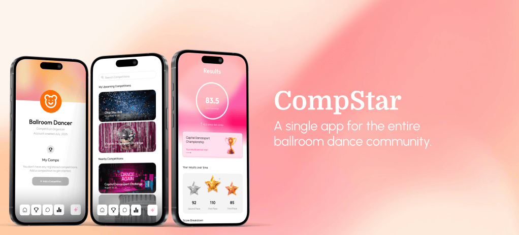
 Lauren Dravis — Product Designer